⛔⛔ MEASURED ON A REAL AIRBNB LISTING FIRST, AND THE PREMISE DOES NOT
HOLD. Listing rooms/23572181 at 1280px, 11 Aug, every
[data-section-id] box read off the page:
• content column x=80 w=653, right rail x=827 w=372
• the rail holds the booking form and nothing else —
BOOK_IT_SIDEBAR (h=272) and a one-line REPORT_TO_AIRBNB
• HOST_OVERVIEW_DEFAULT x=80 w=653 — inline in the body
column, and it has no avatar at all: “Hosted by Gigi · Superhost · 13 years
hosting”, text only
• REVIEWS_DEFAULT x=80 w=1120, full width, y=3352
• MEET_YOUR_HOST x=80 w=1120, full width, y=5694 — 2,342px
BELOW the reviews, holding a 395×265 card
⭐ So Airbnb has two host blocks and neither is in a rail, and its reviews
are nowhere near the host card — they are most of a page above it.
⭐⭐ The side column is still the right build, and the reason is the divergence
itself: Airbnb's rail is occupied because they have something to sell. We have no
reserve form, so our rail is free — this layout is available to us precisely because
we do not carry Airbnb's constraint. ⛔ But it is not “the Airbnb layout” and should not
be described as one to anybody.
⚠️ Three details in the brief were relayed rather than measured, and
two are wrong.
⛔ “Circular 88×88” — the circle is right, the size is not. Airbnb's host
avatar measures 104×104 at border-radius:50%. ⭐ Circular is
faithful: their radius is decided by ROLE, not viewport — full-bleed photo 0, photo in a
card takes the card's corner, avatar 50%. Ours is 88 to match .person__face
on /team/, so one face size serves the system, rather than importing a
number.
⛔⛔ “Small stats underneath in caps” — they are not in caps. Measured on the
elements: number 22px/26px/600 over label 10px/14px/500,
text-transform: none, ink not grey. Reading the rendered case off
textContent would have missed a CSS uppercase; this was taken from computed
style, which is why it can be stated.
⭐ “Hosted by [Name]” is real but belongs to the other component — the
avatar-less inline row, not the card. The card's heading is “Meet your host”.
⛔ And “Hosted by” is not adopted here, on a content ground rather than a
styling one. At aikyam space the space is the host and the partner runs the
session — Olimalar did not host, they ran the reading programme in somebody else's
room. Airbnb's word would assert something false about who owns the place.
The structure transfers; the noun does not.
⭐⭐ IDENTITY BEFORE THE TEXT — verified, not accepted. I have no
record of the thread this was asked from, so rather than copy it I measured Airbnb's review
card: avatar 48px 50% → name 16/20/500 → subline 14/18/400 → stars and date → body
16/24/400. The name really is above the words, and this system's own
.says note had quoted their body treatment while silently inverting their
order. The instruction was right and now has a measurement under it.
⛔⛔ It applies only where there IS an identity. /clubs/'s two
quotations are unattributed by design — “one of the students”, because consent
to appear is not consent to be named — so there is nothing to lead with and the quotation
simply starts. ⭐ That is the same rule with an absent field, not an inconsistency,
which is why this ships as a modifier (.says--named) rather than as a change
to .says itself.
⚠️ Not applied to /clubs/ or /who-we-are/ in this
pass. Four attributed quotations on /who-we-are/ should take the same
modifier; that is a change to two reviewed pages and is named rather than done.
⛔⛔ ONE QUOTATION IS SHOWN AND THREE WERE ASKED FOR, BECAUSE I HAVE THE
TEXT OF ONE. The brief says Olimalar has three now. I have verbatim text for
Aarthi's only, and the component stacks — .saysstack is a grid with no
count in it, so a second and third are markup, not CSS.
⛔ What I deliberately did NOT do to fill the column: there is a real second
Olimalar quotation already in this system, on /who-we-are/ — “aikyam space
felt like home because they truly let it be.” It is about aikyam space, not about
Olimalar, so stacking it under Olimalar's host card would silently change what it is
evidence of. ⭐ Two real quotations is not better than one if the second answers a
different question.
⭐ Send the other two verbatim and they render as-is.
⚠️ Still true and unchanged: the quotation shown is an unpublished draft,
verified against Ghost by team-lead on 11 Aug. And it is the host's own founder speaking
about the host's own session — kept, with the role in the attribution so a reader can
weigh it.
⛔ The inline “With the Olimalar Foundation” line is GONE, and the CSS
behind it is deleted rather than commented out. Owner: the credit takes the card
treatment, not the inline sentence. ⭐ Keeping both would have said the same thing
twice on one page — and dead CSS kept “in case” is how this system accumulates rules
nobody can explain. It is in the history if it is ever wanted back.
⚠️ What that costs, stated: the host is now below the fold on a phone,
because the side column wraps under the body. On the entry it was the third line. ⭐ The
column is still the owner's call and a defensible one — a reader on a phone gets the
story first and the credit after, which is the order a record should have — but it is a
real change for the 34.7% on mobile and should not pass unnoticed.
⭐ How the connection is made in the real build: the entry and the
quotation carry the same host tag, and the entry asks for quotations sharing it. A
body link overrides that where a specific day is being paired. ⛔ Nothing here is
hardcoded, and nothing here should be read as a hand-picked pairing.
⛔⛔ AND THE JOIN HAS ALMOST NO COVERAGE TODAY.
/tag/olimalar-foundation/ holds exactly one published post — this
entry. Four host tags exist (Olimalar, Make A Difference, Rise Up Home, Mind
Empowered); the other three hold two posts each. On today's corpus this column
would render on almost nothing — it is a design that is ahead of its data, and that is
a content decision, not a build one.
⚠️ A reading trap, named because I nearly fell into it: every tag archive
repeats three items — the August guide, the July guide and this entry — as the
theme's recent-posts strip, not as members of the tag. Counting
<article> elements on a tag page overstates every tag by three, and
the overstatement is invisible because the numbers look plausible.
⚠️ Superseded and deleted from this page rather than left standing: the note
arguing where the inline credit sentence belonged. The sentence is gone, so an argument
about its position is now wrong rather than merely stale, and a reviewer reading it
would be told to look for something the page no longer has.
⚠️ Component specimen — a long testimonial and a short one
Both are real, and neither is about
Olimalar. This block exists to show the two length states of the component, not to
claim either person said anything about the reading corner.
-
Sudina S
The home-like feeling. Jasentha Chechi who cooked us breakfast at short notice. The
plants in the front yard. The spacious and group-friendly furniture. These are the
things that made the space special for us.
Show more
-
Leelamma
It was a wonderful experience to conduct our meeting here.
⛔⛔ “SHOULD WE CARD THEM?” — I MEASURED THE REAL PAGE, AND THE ANSWER
IS NO. Airbnb listing rooms/23572181, all four visible review roots:
457×72, radius:0, border:0, background:transparent,
padding:0, no shadow. Not one of them is a box.
⭐⭐ And the separation is pure whitespace — row pitch 226px for a 72px
body, with no rule between reviews at all. The only 1px hairline in the whole section
is a 1120px #DDDDDD SECTION divider. ⛔ So there is no lighter-weight
version of the box to reach for either.
⛔ A bordered box here would reverse the finding that produced this component
— and it is the same finding that got Ghost's bookmark-card embed rejected this morning as
“the opposite of the review treatment”. The box is precisely what a review is not.
⭐⭐ But the ask underneath it is right, and it has a measured answer. Airbnb's
reviews DO stand out, from three things and none of them is a container: an identity
block above the words; looser leading than the text around them — theirs is
16/24 on a page whose body is 16/20, and ours is 16×1.55 = 24.8 against the host
card's 16×1.375 = 22, the same relationship; and air.
⭐ Air was the one we were short of, so the stack now clears the host card by
40px instead of 24. ⚠️ The typography was already doing its job — it was built
from these measurements — which is why the fix is smaller than the question sounded.
⚠️ The honest reason it looked weak, and it is a layout fact rather than a
typographic one: the quotation sits directly beneath a bordered card, so it was
being read against a box rather than against the page. ⭐ Airbnb has this same asymmetry
and keeps it — their host card is boxed (radius 24, shadow) and their reviews are not.
If the column still reads wrong after this, the thing to reconsider is the card's
border, not the quotation's lack of one.
✅ SETTLED 11 Aug — NO AVATAR ON A TESTIMONIAL. Owner: “no pic
needed”. ⛔ The three-way comparison that stood here is deleted along with its two
CSS rules, which were shipped marked specimen-only, delete if the ruling is no
avatar. A comparison of a settled question is clutter, and a kit that keeps every
rejected option becomes a museum. The reasoning is kept below; the rendered
alternatives are not.
⭐ The reason it was recommended, and why the ruling matches: every avatar we
could ever render would be the empty state. There is no photograph of any testimonial
author and none is coming — the system's own rule is never attach a photograph to an
unattributed quotation, and consent to appear is not consent to be pictured.
⛔ Airbnb's avatar earns its place because most of their reviewers have a real face in
it. A column of identical grey discs carries no information — the
no-slot-without-a-filler rule broken in the worst way, a slot whose filler is guaranteed
empty.
⛔⛔ And the case that decided it was the unattributed one.
/clubs/'s two quotations are unattributed by design — “one of the
students”. No name means no initial, so an initial-letter circle could not render
for them at all, and a blank circle beside somebody who chose not to be named is worse than
no circle.
⚠️ What was and was not verified about the reference, kept because it bounds
what we can claim. Measured on the real listing: the avatar container is 48×48,
border-radius:50%, background rgb(221,221,221) — a
neutral grey. ⛔ The screenshot showed a COLOURED circle and the web listing does
not do that — likely the app or another surface. ⚠️ Never established: whether a
letter appears when a reviewer has no photograph, because all six avatars measured had
images in them.
⛔ Two things in his reference do not transfer, and inventing either would be
fabricating data. Stars — these are testimonials, not scored reviews; there is no
rating and there is no scale. The tenure line — theirs reads “6 years on Airbnb”
at 14px/400 #6C6C6C, measured; we hold no equivalent fact per speaker, and
“three years a friend of aikyam” would be a number we made up.
⚠️ The date is the interesting one and I did NOT build it. Theirs sits on the
stars line at the same 14px/400 grey — “1 week ago”. A testimonial's date is real
evidence: recency is most of what makes praise credible. ⛔ But the one we display is
an unpublished draft, and /who-we-are/'s four were deliberately shipped
dateless because a quotation sitting under a day heading is not evidence of when it was
said. Worth adding the moment the posts carry trustworthy dates; not worth inventing
before then.
⭐⭐ What is genuinely new in his reference, once stars, tenure and the face are
set aside: nothing. Identity above, text below, show-more underneath — that is what
is already built, and the screenshot confirms it rather than changing it.
⭐ LENGTH. Measured: the clamp is -webkit-line-clamp: 3,
72px clamped against a 144px scrollHeight, and the control reads “Show more” at
16px/500, underlined. Both reproduced above.
⭐⭐ The owner's framing is the load-bearing part and is kept: a testimonial is
a real Ghost post, so its length is known at build time and it can carry a
custom_excerpt. A plain text blob in a card could not be cut this
cleanly, and that is a genuine argument for the posts-as-testimonials shape.
⛔⛔ One thing from Airbnb deliberately NOT copied: their Show more
is a sibling of the clamp box and renders unconditionally — a review reading only
“Great stay.” still shows it, because nothing compares scrollHeight to
clientHeight. Ours is emitted only when the source really exceeds three
lines — which the build knows and a browser would have to be asked. The short
example above has no control, and that is the point of showing two.
⚠️ Reviewer notes — not page copy
✅ NEW, 11 Aug — the empty space below the side column is not a bug
Measured on the live page at 1280, and it is exactly what it looks like: the story
column is 893px tall, the side column is 441px, and the empty space below
the side column is 452px — precisely the difference between them.
⭐ In plain terms: it is two columns holding different amounts of writing. The
story runs several paragraphs. The host card and one quotation run out after about half
of it. Below that point there is simply nothing left to put beside the story — the
same way one newspaper column finishes before the column next to it.
⛔ Checked for the things that would have made it a defect, and none of them is
present: the side column is position:static (nothing pinning it),
min-height:auto (nothing holding the box open), margin-bottom:0
(no stray spacing), and no align-self stretching it. Nothing is creating
the space; the space is what is left when the content stops.
⚠️ The real option, and I recommend against it. The card could be made
sticky so it follows the reader down the story. ⭐ Airbnb does exactly this —
measured on the live listing: position:sticky; top:80px, and scrolling to
y=1400 moved the rail's viewport position from 580 to 112, so it holds near the top
instead of scrolling away.
⛔ But their rail is a BOOKING FORM — a control you act on at any point while
reading. Ours is a credit: one fact you read once. Following the reader for
452px to keep saying “Olimalar Foundation ran this” is noise, not utility.
⚠️ It would also do nothing on a phone, where the column is stacked under the story
anyway — so it is a desktop-only affordance, on a site that is 62% desktop, buying
repetition rather than access.
⭐ The honest fix for the feeling, if the gap still bothers him, is more to say —
the other two testimonials. The column is short because it holds one quotation. It
was built to stack any number.
⭐⭐ NEW, 11 Aug — the identity unit centres, the prose does not
Owner: the avatar and name are centred on the real card and ours were left-aligned.
He is right — and centring the whole card would have been the wrong fix.
Measured on Airbnb's 395×265 card (padding: 32px 24px), it is two
columns:
• Left column 227×201, display:flex,
align-items:center, justify-content:center. The 104×104 avatar
sits at x=86 with 62px of column to its left and 61px to its right — centred in
ITS COLUMN, not in the card, which still has 206px to its right. The “Superhost”
badge under it computes text-align:center.
• Right column at x=275 — the stats — and they compute
text-align:start. Left, not centred.
⛔⛔ And every piece of prose is left-aligned AND lives outside the card entirely —
“Speaks English and Hindi”, “My work: …”, “Response rate: 100%”, “Responds within an
hour”, all text-align:start, all outside the 395×265 box.
⭐ So the rule on Airbnb's page is narrow: the identity unit — face, name, badge —
centres, and anything you READ stays left. That is what the measurement says, and it
stands as a fact about their card.
⛔⛔ OWNER OVERRULED IT THE SAME EVENING, and the card now centres as one column.
Five changes marked directly on it: avatar centred · name centred AND stepped down to
the link's size · “Ran this session” struck out entirely · description centred · link
centred. Built as marked.
⭐ And it is a defensible departure rather than a mistake, for a reason the
measurement itself supplies: Airbnb's card is a booking-adjacent block with a stats
column, and that second column is what makes their left-aligned identity unit sit off
to one side. Ours has no stats column — the count was dropped this morning — so
a single centred stack is the honest shape for what is actually left in the box.
A two-column rule copied onto a one-column card would be cargo.
⚠️ We also keep the description inside the card where Airbnb puts it outside, because
a 344px sidebar has nowhere else for it.
⚠️ The cost, stated once and not relitigated: centred prose is harder to read
than left-aligned — both edges rag, so the eye loses the line start on every return
sweep, and the description runs three to four lines at 41–49 characters. Raised before
the ruling, overruled, built as marked.
⛔ .hostcard__id and .hostcard__role are deleted, not
disabled. The wrapper's only job was to centre part of a card that now centres whole;
the role line is struck from the design. ⚠️ That also retires the specificity fix made
to .hostcard__role an hour earlier — it is recorded rather than quietly
dropped, because the same collision will bite the next single-class rule added to this
card.
⛔ A specificity bug found in the same pass, in my own component:
.hostcard__role was a bare class at (0,1,0) and lost to .hostcard p
at (0,1,1) declared below it, so the 8px gap it asks for was rendering as 12px.
Fourth single-class override in this stylesheet beaten by a descendant selector —
found by reading the file because it had happened three times, not by looking at
the page.
⛔ NEW, 11 Aug — the nav gap was pre-existing, and the sidebar only exposed it
Owner: “no padding between the nav menu and the content.” Measured against the
nav's bottom edge on the live page: this page's h1 ink began at −1px, and the host
card's top border at exactly 0 — a line drawn hard against the nav's own border.
⭐ But it did not start with the side column. Every other page opens with
.lede, which carries padding-block: var(--space-8) and puts its
first ink at 69px. /clubs/ and /who-we-are/ both measure
69. This page has no .lede and never had the gap — the entry opened
straight onto its headline from the day it was built, and four reviews did not catch it.
⭐⭐ What the sidebar changed was visibility, not the defect. Bare text at −1px
reads as tight; a bordered box at 0 reads as broken. ⚠️ Worth keeping as a
pattern: adding a bordered element is a cheap way to discover the spacing bugs a page
already had, because a border makes a boundary that text only implies.
⚠️ Fixed on .entrygrid, not page-wide, and the scope is deliberate:
the other four pages get their 40px by accident of carrying a .lede —
spacing riding on a semantic class. The durable fix is a rule that says content does
not start flush against the nav, which would re-space four already-reviewed pages and
is not this brief.
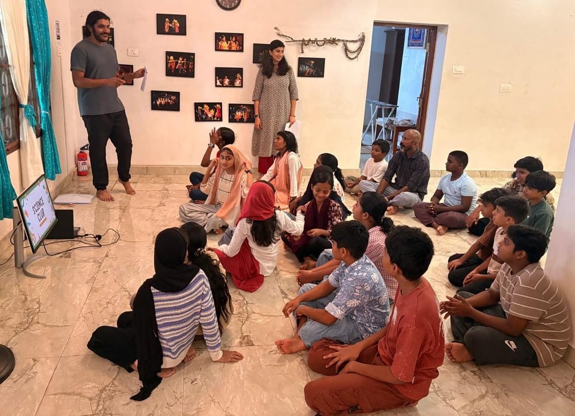
⛔⛔ NEW, 11 Aug — the headline says Reading Corner and the photograph shows the
science class
Look at the screen in the picture. It reads “SCIENCE CLUB”. There are no books
and no reading corner in the frame. The body says “The science class continued with
hands-on learning, while children also began using the new Reading Corner” —
the headline takes the second clause and the only photograph documents the
first.
⭐⭐ This is the exact failure this kit already predicted, and it has already
shipped. Note 1 below says “a generated headline can be accurate and still pick
the wrong one of the day's two events.” It did. Every word of the headline is
supported by the body, so the guardrail “nothing in a headline that is not in the body”
passes on this entry.
⛔ So the guardrail is not enough, and the fix is one more sentence in the brief:
where a day carries two events, the headline takes the one the photograph shows —
because on this page the photograph is the largest thing on the screen and it is read
before the words. ⚠️ Nothing automated can check this; it needs the human
spot-check that is already planned, told what to look for.
⚠️ Second-order, and it dates the picture: Science Club was renamed Curiosity
Club on 10 Aug. The photograph now shows a screen carrying a retired name.
⛔ Leave it. It is a record of 4 July and it was called Science Club on 4 July —
a record that is edited to match today's vocabulary stops being a record.
⛔⛔ 0. AUDITED 10 Aug — this page opened on a blurry cat and no words
Measured on the served page, then looked at. The photograph was
aspect-ratio: 4/3 + object-fit: cover at container
width, which rendered 992×744. On a 1280×871 laptop the entire first screen
was one image — the headline began at y=947, below the fold — and because the
source is a 960×1280 portrait, the crop threw away most of the frame and
scaled what was left past its own pixel width. It was soft.
⛔ This is the arrival page for 60.8% direct traffic. Someone opening a WhatsApp
link saw a cropped, blurry cat and not one word — no headline, no date, no place.
⚠️ Every geometric check passed: zero overflow at 390 and 1280, prose on
--measure, no border anywhere. Only the screenshot found it.
⭐⭐ Airbnb, measured live the same hour (listing 23572181, 1710px viewport):
the title sits ABOVE the gallery — TITLE at y=96, HERO at y=150 — and the whole
hero is 483px tall in a 1120px column, a mosaic of 560×459 plus four ~272×225 tiles.
They never let one image be 4:3 at full column width.
⭐ So the defect was never the photo's WIDTH. Ours was 992 against 544 of prose,
a 1.8× ratio; Airbnb runs 1120 against 653, which is the same. It was the HEIGHT.
⛔ Fixed by bounding height and removing the forced ratio — max-height:
32rem, width: auto, no crop. A portrait now renders 384×512, a
landscape a wide band, and neither is ever scaled past its intrinsic width.
⭐⭐ And the reason it is a crop rather than a fit is a product argument, not a
taste one: in a listing the photograph SELLS, in a record it is EVIDENCE. Cropping a
phone snapshot to a tidy landscape strip removes the thing it is evidence of. The card
in the feed may crop — it is an index. This page must not.
⚠️ Two smaller faults found in the same pass, both fixed: the
width/height attributes said 1600×1200 for a
960×1280 image — so the reserved box had the wrong shape and the browser used
the wrong ratio — and the date read “Thursday 7 August” when 7 August 2026 is a
Friday. ⛔ For the importer: take both dimensions from Ghost's own image
metadata per image, never a constant, and derive the weekday from the date.
⚠️ Deliberate trade, stated: a portrait now occupies 384px of a 992px column,
left-aligned with the headline. One left edge is the house rule and it reads
correctly, but it is quieter than a full-width hero. ⭐ The alternative — Airbnb's
multi-photo mosaic — needs several photographs per entry, and the corpus has one.
⭐ RE-MEASURED 11 Aug on the new exemplar, which is a landscape. The
1143×827 source renders 708×512 at 1280 — height capped at 32rem,
never scaled past its own 1143px — against 544px of prose, a 1.30× ratio
where Airbnb runs 1.71×. Headline, date and credit all sit above it, so the first
screen carries words. ⚠️ The cat numbers above are kept as the record of the audit
that produced the rule; they describe the previous exemplar, not this one.
⛔⛔ NEW, 11 Aug — the quotation column was 20px text in a 16px column, on three
pages
.says capped at 22rem because Airbnb's review column measures
450px. But Airbnb's review text is 16px and ours is 20px — ⭐ the invariant
is the character count, not the pixel width. Counted with a Range on the rendered
page: 36 characters on this entry and 38–41 on /clubs/,
against Airbnb's ~56 and this system's own 45–75 band. Under the ~35 floor where a
paragraph reads as confetti.
⛔ Where it bit hardest: /clubs/'s two student quotations —
“At first, I didn't know how to stitch. Today, I made this bag on my own.” —
the strongest sentences on this site, set in the narrowest column on it.
⭐ Fixed by one token, --measure-small → --measure. The
same three quotations now count 53, 61 and 62. Zero overflow at 390 and 1280 on
both pages, and /clubs/ was looked at, not only measured.
⚠️ Beyond this brief, and stated because it changes a page nobody asked me to
touch: on /clubs/ the quotation is now wider (544px, 20px) than the
club's own description (352px, 16px). ⭐ That is the right way round — the
description is secondary metadata and the quotation is evidence — but it is a
visible change to an already-reviewed page.
⭐ 1. Headlines: Claude backfills, the writer takes over
Owner ruled Claude writes the backfill headlines, with three guardrails:
nothing in a headline that is not in the body; a twenty-entry human spot-check
read consecutively rather than at random; and ⭐ backfill only — going forward,
the person who writes the entry writes the headline.
⭐ That last one is the important one and it is not about quality. August 7
carried two things — a stitching session and the cats. Only somebody who was there
knows which of them mattered. A generated headline can be accurate and still pick
the wrong one of the day's two events.
⚠️ Consecutively, not at random, is the right check — errors in generated
headlines cluster by pattern, and a random sample of twenty across six months would show
one of each while a consecutive twenty shows the pattern repeating.
⭐ 2. Three image states, and only a tag can tell two of them apart
Owner ruled: a placeholder image and a needs-photo tag on every entry
waiting for a photograph.
| state | image | tag |
|---|
| photo pending | placeholder | needs-photo |
| photo added | the real photograph, which becomes og:image | tag removed |
| ⭐ genuinely no photo, ever | none | none |
⭐⭐ The third row is why the tag exists rather than the image. “Waiting for a
photograph” and “there will never be a photograph” are different states, and
the image cannot distinguish them — only the tag can. ⛔ The 2 August entry
above stays image-less and untagged: a placeholder there would promise a photograph
that is never coming.
⛔ A placeholder is a PRE-LAUNCH state that cannot survive launch by
construction — see the build gate below. Nobody should design this page around
the placeholder looking good, because on the day it goes live none exists.
⚠️ I recommended against the placeholder and was overruled, and the override was
right. My objection was that a placeholder becomes og:image, so
every shared link renders a grey “coming soon” card in a WhatsApp thread — a bad
image card in place of a clean text one, on the 60.8% who arrive that way. ⭐ The
owner's answer was operational: his team cannot add photographs to entries they cannot
find, and the tag is how they find them. He knows how his team works and I do not.
⭐ The build gate is what makes “it will be changed before live” true rather than
assumed — so the objection is answered by a mechanism instead of by trust.
⛔ 3. The launch gate — the build fails while any placeholder remains
The placeholder is one known URL, so it is a count. ⭐ The failure is never
that people are careless — it is that nothing tells them. If three entries in 150
keep the placeholder, nobody notices by eye and the check notices every time.
⛔ Break it on purpose before trusting it: point one entry at the placeholder,
watch the build go red, revert, watch it go green. A gate that has never failed is
not known to work — and this project has produced two gates today that could not
fail at all.
⚠️ Count the needs-photo tag as well as the image URL. They can
disagree — an entry given a real photograph with the tag left on, or tagged with the
placeholder already replaced — and a gate that checks one of two fields passes on the
state where they diverge.
⛔ 4. The bodies may be rewritten — and one thing inside them may not
Owner, 10 Aug 2026: “the reader is important. not the author.” So the
backfill may rewrite bodies for clarity, not only supply headlines. ⭐ The order still
stands: headline first, rewrite only where the headline cannot carry it — a headline
that supplies a missing referent is less invasive than a rewrite. ⛔ Do not rewrite
150 bodies because you now may.
⛔ Rewriting for clarity is not inventing. “The same group returned” →
“The dance group returned” supplies a referent that exists elsewhere in the
corpus. Adding a detail that appears nowhere is a different act and is still
forbidden. Every fact in a rewritten body must be traceable to its source month.
⛔⛔ And the line the ruling does not reach: a quotation is not the narrator.
“The reader over the author” is about the person narrating the day — not about the
people quoted inside it. “I never thought I'd be able to dance at this age”
is evidence because it is somebody's actual words. Tidied, it becomes a claim the
organisation makes about itself. ⭐ A rewrite pass that treats a quoted sentence as
prose would destroy the most valuable content on this site while looking like an
improvement. Detect quotation before rewriting; leave it exactly as found.
⚠️ One property, recorded so it is not drifted into: with ~150 rewritten bodies
the archive becomes a clear record of what happened rather than a record in
the words of the people who were there. Both are legitimate and he has chosen the
first. ⭐ It applies only to the backfill — going forward the team writes their
own — so the two halves of the archive will differ in voice, and someone
reading June beside next June should know that is a boundary rather than a drop in
quality.
⚠️ 5. What this page cannot answer
Whether the slug is stable. If a headline is edited after publication and the
slug follows it, every link already shared in a WhatsApp thread breaks — and
those are exactly the 60.8% this page is designed for. ⛔ The slug must be frozen at
publish and never track a later headline edit. That is an importer and Ghost
behaviour question, not a design one, and it belongs beside the redirect discipline in
ASTRO-PLAN.md.